Yipwon

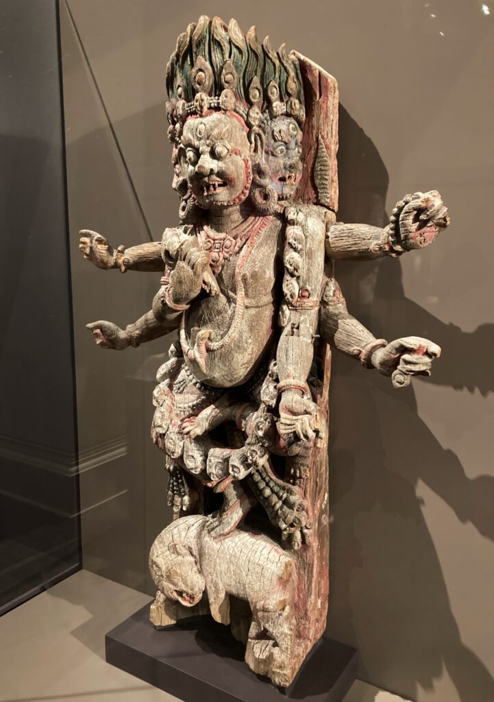
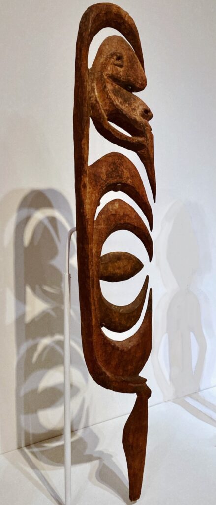
This deity is a yipwon figure, from the Yimam people who live along the Karawari River in East Sepik Province, Papua New Guinea. Since I know essentially nothing about the Yimam people and their deities, I’m going to quote from various authorities who claim to know something.

A human-sized wood sculpture with a stylized head over stylized hooks, standing on a single leg.
Yipwon figure in the Boston Museum of Fine Arts, acc. no. 2014.306

Maia Nuku, in the recent book Oceania: The Shape of Time (Metropolitan Museum of Art, 2023), says this about yipwon figures.:

Christian Kaufmann, Korewori: Magic Art from the Rain Forest (University of Hawaii Press, 2003), pp. 70-71, gives a version of the myth they say underlies the yipwon figures:

The Metropolitan Museu of Art has photographs of several yipwon figures on their web site. On the web page for one of those figures, they give a somewhat different summary of the same myth, probably from the same source (Seyfarth and Haberland):

I found very little information online about the Yimam people, who are also called the Alamblak people. The Joshua Project, a Christian group that aims to spread their religion to other peoples, claims that there are 3,100 Alamblak people today; they claim that currently 90% of the Alamblak are Christian, and they link to a translation of the Christian Bible into the Alamblak language. The only other references I could find to the Yimam or Alamblak people was in relation to their artworks. It seems that the only value the Alamblak / Yimam people have to the First World is either to provide artworks (which sell for quite high figures), or to provide converts to Christianity. And I wonder how much remains of their old religion and mythology: are the yipwon still active?

Uma

In the Walters Art Museum in Baltimore, there’s a lovely small sculpture of the god Shiva with his wife Uma. It was made in the 13th century CE out of “copper alloy” in Tamil Nadu, the southernmost state in India.

A sculpture of a male god with one of his four arms around a female goddess.
Shiva and Uma, Walker Art Museum, acc. no. 54.3023. Uma is on the right.

But wait a minute…isn’t Shiva married to Parvati? Who is Uma?

For a partial answer to the question of Uma’s identity, I looked at the Kena-Upanishad, which can be found of the Talavakara-Upanishad. I used Max Mueller’s translation in The Upanishads Part I, Sacred Books of the East series, volume I (Oxford, U.K.: Clarendon Press, 1897), pp. 46 ff. The third and fourth khandas of this upanishad tell how Brahman, the ultimate reality or highest deity, is more powerful than anything else in the universe, more powerful even than various other gods and goddesses. Mueller’s translation of the third khanda (verses 1-12), and the first verse of the fourth khanda, reads as follows:

In a footnote, Mueller provides some information about Uma:

David R Kinsley, in his book Hindu Goddesses: Visions of the Divine Feminine in the Hindu Religious Traditions (Berkeley: Univ. of Calif. Press, 1986), p. 36, has a somewhat different take on who Uma in this upanishad might be:

How can we make sense of all this? On Hindu Blog, which gives contemporary popular accounts of Hinduism, writer Abhilash Rajendran cites the Encyclopedia of Hinduism, vol XI (India Heritage Research Foundation and Rupa Publications, 2012) p. 22, and says Uma “has thousands of names depending on which way a devotee want to perceive her.” Rajendran goes on to say that some of the key aspects of Uma’s symbolism include feminine energy, “motherly love and nurturing,” balance, harmony, and “asceticism and devotion.” She can also appear as a “fierce warrior goddess”; and in fact, Kali is one of her manifestations.

Other sources may depict Uma slightly differently, but the gist of her is always the same: the great power of the feminine. Don’t mess with Uma.

Adventures in cyanotype

(Written on July 3, finally getting around to posting on July 12.)

I’m running an ecology workshop at a small conference at Ferry Beach Park Association in Saco, Maine. One of the activities I did to get participants to see the world in new ways was making cyanotype prints of plants. I was inspired in part by Anna Atkins, who created the first-ever book of photographs with cyanotypes of seaweed.

Thea and Mandy were leading an art workshop at the same time, and they got interested in cyanotypes. So after our morning workshops were over, we did some experimenting. In the evenings, after it got dark, we coated several different kinds of paper with cyanotype emulsion. During the day, we experimented with different compositions using natural object to make photograms. We even took a field trip to the Portland Museum of Art, where there’s a special exhibit of Jo Sandman’s large photograms on platinum-palladium paper.

We didn’t wind up with much in the way of finished art works. But we learned a great deal. As Thea kept reminding us, often the process is more important than the product.

Bhairava

This representation of the deity Bhairava, now in the Walters Art Museum in Baltimore, was once part of a building in Nepal’s Kathmandu Valley. The deity was an integral part of a wooden support that supported an overhanging eave.

A deity carved in wood, with four arms and three heads.
The museum label reads: “Strut with Bhairava, Nepal (Kathmandu Valley), ca. 1700, Wood with traces of pigment…. Gift of John and Berthe Ford, 2021, acc. no. 25.271”

Bhairava is actually one of the forms that the Hindu deity Shiva takes on. H. Krishna Sastri, who was Asst. Archeological Superintendent for Epigraphy (Southern Circle) in the early twentieth century, describes Bhairava in his book South-Indian Images of Gods and Goddesses (Madras Government Press, 1916), p. 151:

I don’t know to what extent Bhairava takes on another form in Nepal, but the Bhairava in the Walters Art Museum does in fact have round eyes, protruding teeth, and wide nostrils. He wears a garland of either skulls or heads, and something that could be a snake is draped around his neck. At one time, his six hands held various items, but those are all lost now — perhaps they included a trident, a sword, and/or other destructive weapons. He is either naked or close to it, and he is riding on the back of an animal that could be a dog. In short, this Bhairava from the Kathmandu Valley seems to be very similar to the South-Indian Bhairava described by H. K. Sastri in 1916.

The Daya Foundation, a Nepalese nonprofit organization, published a blog post last August titled “Bhairav in Nepal.” In that post, they offered this interpretation of Bhairava’s origins:

In this blog post, the Daya Foundation describe some of the ongoing worship of Bhairava. Among other things, Bhairava is connected with the Nepalese monarchy, “as a guardian of both the spiritual and the civic welfare of Kathmandu.”

Why Are You You?

I’ve got convention brain. What did I do after yesterday’s business meeting? What programming did I attend? With whom did I talk? It’s a bit of a blur.

But I do know that last night I went to a screening of the documentary “Why Are You You?” a new documentary about the now-defunct youth program Young Religious Unitarian Universalists, or YRUU. I was fairly heavily involved in YRUU as an adult advisor from 1995 through about 2003, serving as an advisor in local youth groups, as well as at district and continental “cons” or conventions. As a result, I got to meet youth leaders and youth advisors across the continent, from Alaska to Maine.

The filmmakers interviewed a number of former YRUU youth leaders, and I recognized several of them. I enjoyed hearing their memories of YRUU conferences and programs; I especially enjoyed hearing about how YRUU changed their lives. Given all those hours I spent supporting youth leaders and UU youth institutions, it’s nice to know that those hours weren’t wasted. But the ending of the movie is a little depressing. The Unitarian Universalist Association (UUA) ended funding for YRUU in (I think) 2007. There was no replacement for YRUU — YRUU was a semi-independent organization with youth leadership, not just another department of the UUA.

Not that YRUU was perfect. The documentary touches on some of its problems. What’s missing are the voices of all those teens for whom district and national YRUU programs held no interest, or those for whom YRUU did not feel safe — I knew quite a few of those teens, some of whom were devoted members of a local youth group. What’s also missing is mention of the adult advisors with poor boundaries — I saw a few too many of those; part of the reason I pulled away from district and national youth events was that I felt YRUU didn’t train adults adequately, nor hold them fully accountable.

Yet these were all solvable problems. The solution was not to get rid of the national youth organization; the solution was to reform that organization. For the past twenty years, I’ve had the sense that Unitarian Universalism broadly construed, especially at the national level, just really doesn’t like children and teens. Children and teens are messy, they take up a lot of time and energy, and if you don’t like them that much, it’s easier to shut them out rather than support them and their families. I feel that the death of YRUU is part of this larger trend.


P.S.: If the issues raised by this film are of interest, you might also be interested in childist theology, a new approach to Biblical interpretation that places children at the center of Biblical interpretation. So… What would it mean to place children and teens at the center of a Unitarian Universalist theology?

South Arabian goddess

The Walters Museum in Baltimore has a small selection of South Arabian art. I’m completely unfamiliar with South Arabian art, and before I went to the Walters Museum yesterday I knew nothing about its long history. According to the Smithsonian National Museum of Asian Art:

“For over a thousand years, from around 800 B.C.E. to 600 C.E., the kingdoms of Qataban, Saba (biblical Sheba), and Himyar grew fabulously wealthy from their control over the caravan routes of the southern Arabian peninsula and, in particular, from the international trade in frankincense and myrrh. Excavations at the capitals of these ancient kingdoms have yielded spectacular examples of architecture, distinctive stone funerary sculpture, elaborate inscriptions on stone, bronze, and wood, and sophisticated metalwork.”

One of my favorite pieces of South Arabian art on the view at the Walters Museum is an unnamed goddess, who appears in a fragment of a pediment. She sits next to a child deity. Due to the lighting, I found it difficult to take a photograph due to the reflections on the glass case which houses this goddess; I had to do a fair amount of digital manipulation to make her look more or less the way she looks in the museum.

Sculpture carved in stone.

Here’s what the museum label says about this sculpture:

I wonder if she was really a fertility goddess, or a goddess of wine. I don’t think we’ll ever know.

Trash art

Our congregation’s Ecojustice Camp, a week-long summer camp, just finished its overnight. We left no trash ourselves, but we scoured our campsite for trash that might have been left by others. The campers carefully arranged the trash on a picnic table. Here’s a photo of all the trash we found:

A collection of trash on a picnic table, with hands of children pointing at it.

When they saw this photo, the campers said, “Hey, it looks like art!” (Shades of Kurt Schwitters and Robert Rauschenberg….)

Anyway. There you have it…trash art.

Cyanotype…notes to myself

I wrote this post while I was experimenting with cyanotype as a way to get people to look more closely at plants. I updated it several times, with the final revision on 21 August 2025.

(Updates: 30 May; 12 July 2025; 17 July; 20 July 2025. Final revision, 21 August 2025.)


Cyanotype books

Many of the books on cyanotype available online are self-published. The following two books come from reputable publishers.

Cyanotype: The Blueprint in Contemporary Practice by Christina Anderson (Focal Press, 2019), covers everything you need to know about cyanotypes — setting up a “dim room”; how to coat your own cyanotype paper; recipes for classic cyanotype, new cyanotype, and other formulas; how to tone prints; and more. Anderson tested over 100 different papers to see which worked best for cyanotype, and there’s a whole chapter on paper. The last chapter of the book showcases artwork by contemporary cyanotype artists. This is a must-have book.

Cyanotype Toning: Using Botanicals To Tone Blueprints Naturally by Annette Golaz (Routledge, 2021) is an excellent introduction to toning cyanotypes using plant materials. Aimed at the proficient cyanotype artist, Golaz shows how to achieve a wide range of colors that take you far beyond the typical blue cyanotype.


Cyanotype supplies

Chemistry

Jacquard Products sells cyanotype sets — two plastic bottles with cyanotype chemicals that you fill with water, then mix the resulting solutions 1 to 1 when you’re ready to coat your paper. (I bought mine at an independent art supply store, and it was super easy to use.) I also bought a Jacquard kit which included chemicals, brush, glass plate for contact printing, and some Hahnemuhle Platinum paper — it’s probably overpriced, but I found the kit helped me get started.

Bostick and Sullivan is the major supplier of alternative photographic processes. I have not ordered from them, but they have everything you need for cyanotypes. Other sources for cyanotype chemistry include Photographer’s Formulary, The Cyanotype Store, and Fotospeed.

Paper

Finding paper that’s good for cyanotype can be a challenge, since not only must the paper stand up well to repeated wetting, but the pH of the paper is also important. See Christina Andersons’ book for comprehensive information on papers.

One of the inexpensive papers Anderson recommends is Canson XL Watercolor paper. This is currently my go-to paper, and I can recommend it. Widely available at places like Michael’s and Dick Blick.

Both Anderson and Golaz say Hahnemuhle Sumi-e is an excellent lightweight paper to use in cyanotype. I got mine at the Art Mart in Portland, Maine, which stocks it. Or, Bostick and Sullivan sell Hahnemuhle Sumi-e online. It requires gentle handling, but produces beautiful results.

At a week-long summer art workshop, three of us loved Fabriano Medievalis paper. It’s slightly cream-colored, which sets off the Prussian blue of the cyanotype nicely. However, it does not stand up well to toning, or long wash baths.

I’ve also used Yasutomo “Sketch,” which produces similar results to Hahnemuhle Sumi-e, but is much less expensive. However, it’s very fragile in water and tears easily during the developing process — you can forget about bleaching and toning this paper. If you’re on a budget and very patient, maybe give it a try.

Cyanotype in the classroom

Lawrence Hall of Science sells “Sunprint Kits” with 12 pieces of 4 inch square cyanotype paper and a clear acrylic overlay sheet. Cost buying direct from them is US$5.99 per kit (do not buy from Amazon where the price is higher). This cyanotype paper develops quickly and requires little water to develop — perfect for classroom use. They also sell refill packs of 12 sheets of cyanotype paper for US$3.99, as well as 8-1/2 by 11 inch cyanotype paper. The kits and refills are ideal for class use — inexpensive enough to allow people to experiment.

My younger sister the children’s librarian uses 5×7 inch “Nature Print” cyanotype paper from Dick Blick. It’s just as good, but I’ll stick with the Lawrence Hall of Science paper, because my purchase helps support their science education mission.


Cyanotype websites

Many of the cyanotype websites appear to be “AI”-generated slime. Others are too basic (“Expose the cyanotype paper, put it water, look at the result!”). But I found the following websites to be worth a look.

Cyanotypes with plants

Cyanotype by Angela Chalmers, a PDF, gives instructions on making cyanotype photograms using plants. Great ideas, and the author’s photograms are gorgeous.

“How To Make Cyanotypes of Flowers” on the Nature TTL website includes very useful instructions on a specific form of wet cyanotype process.

A digitized version of Anna Atkins’s book of botanical cyanotypes is online at London’s Natural History Museum website. A scholarly article with an analysis of Atkins’s book from the point of view literary analysis can be found here.

Atlas Obscura has samples of a 12 year old’s botanical cyanotypes here. Educators might find this inspiring.

Cyanotype techniques

Toning can alter the bright blue color of cyanotypes. Jacquard has a guide to toning cyanotypes to produce various colors.

The “Koraks Tinkers” blog has a post pointing out the difference between collimated vs. diffuse light when exposing cyanotypes. Direct sunlight provides collimated light, while an overcast day provides diffuse light. This difference is less important when making contact prints from a negative, but will produce quite different results with 3-D objects. Cloudy skies = diffuse light, and blurred edges. Clear skies = collimated light, and sharp edges.

UV light boxes

A UV light box allows you to expose cyanotypes indoors, or at night. I finally decided not to build a UV light box (no room for one in our tiny apartment), but here’s some info I collected while researching them.

Photographer Steph Coffman has a page on her website detailing how she made a UV light box — inexpensive and effective. A photography teacher from CCSF shows how to make an even cheaper UV light box — unfortunately, the UV light source she used is no longer available; her video is still worth watching, just to see how she does it. The Alternative Photography website has instructions for making inexpensive UV boxes. Finally, the “Koraks Tinkers” blog shows how to build your own custom UV light box with an LED array — but you have to be comfortable using soldering irons and test equipment.

Photogram of two leaves.
Cyanotype of two mullein leaves. The leaves were dampened before placing on the paper, so this is a partially wet cyanotype process — this yields the greenish hues seen above — and a longer exposure would have revealed more details of the veins in the leaf.

The original colors of New England meetinghouses

There’s a stereotype that all the old colonial-era meetinghouses in New England were covered with white paint both inside and outside.

Not true.

According to Peter Benes, in his definitive book Meetinghouses of Early New England, there was a wide range of exterior colors, ranging from unpainted to blue to green to orange. The Cohasset Meetinghouse was built in 1747; the first record of its exterior color dates to 1812, when it was pea-green with white trim.

As for the interior color, an architectural consultant hired for the 1986 renovation found what he thought was a bit of the original interior paint color under the pulpit. When the steps to the pulpit were remodeled c. 1837, a board was left behind with pale yellow paint marking out where the former steps were. The architectural consultant believed this was the original color. While he didn’t give his reasoning, the layer of paint is quite thin, thinner than you’d expect if it had been recoated at some point.

Pea-green outside, and pale yellow inside, not stark white. How tastes have changed over the years.

Old wood showing some pale yellow paint.

Changes in a New England Meetinghouse

First Parish in Cohasset, where I work, has a meetinghouse built in 1747. When you come at it from the north and see it across Cohasset Common, it looks like the classic white New England church with a simple steeple:

White clapboard New England church set amid lawn and autumnal trees
Cohasset Meeting House from the north

But the tower and the steeple weren’t added until 1799, over half a century after the meetinghouse was first erected. Let’s go back to 1773, the year of the Boston Tea Party. There were three young men from Cohasset who participated in the Boston Tea Party (after being encouraged by their Patriot minister), and they might have seen something like this when they came at the meetinghouse from the north:

Line drawing of Cohasset meetinghouse before the tower and steeple were added
My visualization of the appearance of the Cohasset Meetinghouse c. 1775

Instead of the tower and steeple, there would have been small belfry on the north end of the building. (When you go up into the attic today, you can see timbers in the north end that now serve no special purpose, and it’s possible they served to support the belfry.) I haven’t found any record of what Cohasset’s belfry looked like, but there are drawings of other eighteenth century meetinghouses with belfries. The sketch above shows the north facade with a representative eighteenth century belfry.

This still isn’t the original appearance of the Cohasset Meetinghouse. Originally, there was no porch on the west side. That porch was built in 1761. In order to create more floor spaces for pews, the original stairs to the gallery in the northwest and southwest corners inside the main building were removed. The porch was added to house a new set of stairs to the gallery. Prior to the addition of the porch, the Cohasset Meetinghouse looked something like this:

Line drawing of meetinghouse
My visualization of the appearance of the Cohasset Meetinghouse c. 1760

As you can see, prior to the addition of the porch the meetinghouse was just a simple rectangular building with a small belfry on the north end. Mind you, we don’t really know the exact appearance of the building. In my visualizations, I’ve added triangular pediments above the doors, but who knows if there was even that level of ornamentation.

The earliest drawings we have of the Cohasset Meetinghouse date from the mid-nineteenth century. They are fairly consistent in showing the tower with crossed balusters at the bell level, and a steeple with a rounded section before the actual spire — quite different from the present steeple. The meetinghouse was not painted white; it was pea green. In fact, most New England meetinghouses were not painted white prior to the Colonial Revival in the late nineteenth century; documented colors include various shades of yellow, red, and green; there were even a few meetinghouses painted orange. Here’s my digitally edited version of an 1850s woodcut showing the Cohasset Meetinghouse:

Reproduction of a woddcut

There have been several other changes over the years. The clock was added in 1764. Shutters (or more accurately, exterior louvered blinds) were added around 1765. The steeple was completely rebuilt after 1869; it got shattered by a lightning strike in that year. The shutters were removed again around 1986.

In short, like most historic buildings the Cohasset Meetinghouse has changed considerably over the years.