
Back in 1970s, while still in high school, I was really into topographic maps. I tried making topo maps of parts of Concord, Massachusetts, where I then lived. This was back in the days of drawing with pen and ink on paper, so making maps was challenging and fun.
I remember reading somewhere about what was then called the “greenhouse effect,” which would prompt the melting of the polar ice caps. I forget the amount of sea level rise predicted. But when I looked at a topo map of Concord, most of the town would be underwater, with just a few of the tallest hills was islands.
Yep, we knew back then about what is now called global climate change. Then, as Michael Mann has documented in his book The New Climate War, the oil companies conducted a massive disinformation campaign. The oil companies basically hijacked our elected officials while we weren’t paying attention. And here we are today, even more worried about sea level rise.
With all that in mind, I was glad to find the Conspiracy of Cartographers website. They make maps showing what things will look like if the sea level rises 66 meters — the current best estimate assuming all the polar ice melts. Here’s a link to their map of the Boston area. I love their place names: Concord Bay, Lexington Archipelago, Flint Island — this last represents what is now high ground to the east of Walden Pond. Here’s a screen grab of part of their Boston map:
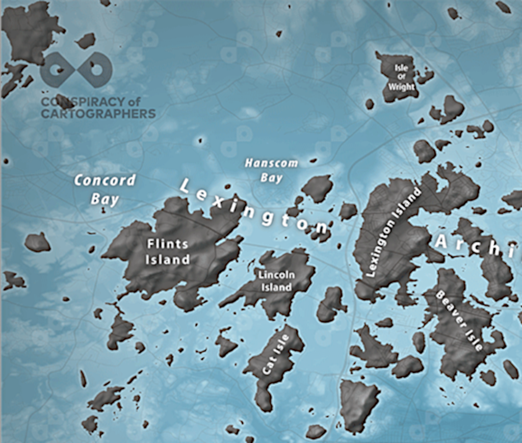
Beautiful maps. And depressing. And a very good corrective to the decades of lies and misinformation emanating from the oil companies.